Rereading my post over at Shandler Park today, I was struck that it might be useful to look at the outcomes for pitchers last year who started the season off badly. That is, they had a bad April.
But when I started looking at the spreadsheet my first impulse was to take a look at the $1 starters last year, since in my AL and NL leagues this year I’m relying on similar arms and know that I have to manage them well for my teams to do well.
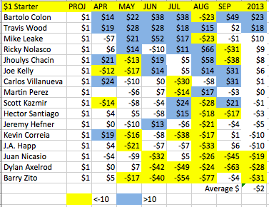
Here are last year’s $1 pitchers with 15 or more starts.
 The guys who had good years were generally good all season long, the guys who had bad years were generally crummy all season long. As a group they were a little better in the first half, but the sample is small enough I wouldn’t think too much about that. For sure by June no one was playing Barry Zito, which is what we care about.
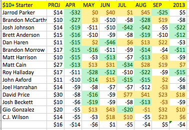
So, how about the $10+ Pitcher who got off to a bad start last year. Here are the Bottom 15 from 2013. The Green cells denote those who rank in the bottom 33 percent for the month. The Yellow cells denote those who rank in the top 33 percent for the month.
 Selecting for failure among the fairly well regarded, we see that it wasn’t impossible for these pitchers to return to form. In fact, only one of these pitchers, Josh Johnson, lost more than he earned after April 30th.
Of the hot pitchers in April, only Doug Fister, Justin Verlander and Matt Moore took a big hit. The rest were pretty darn steady, notably earning a collective profit every month but September.
Blue represents > $10 earnings. Yellow represents <-$10 earnings.
There’s a lot of blue here. Good pitchers who get off to solid starts are generally solid.
To summarize, pitchers with solid expectations who get off to a bad start are generally unable to regain expectations, while those who get off to a good start generally beat expectations.
Next we’ll survey the mess of the not-so-desired pitchers.


Pingback: ASK ROTOMAN: Whither Matt Harvey? – Ask Rotoman